Beyond Hunger
Intuitive Website
Transformation:
Beyond Hunger
BH's Mission
Dedicated to healing body hatred and disordered eating, Beyond Hunger provides prevention & educational programs for schools. Beyond Hunger’s philosophy integrates intuitive eating, body acceptance, and emotional intelligence.
This is a real non-profit website redesign project created by me and my group of UXers.
My Role
I led my team on the redesign of website, first contacting the stakeholder, Katy Litwack.
I contributed during the user research phase, tests, storyboard, card sorting, ideation and brainstorming, information architecture, user flows, prioritization matrices, etc.
UNTIL
I met with Katy again, submitting the finalized iterated hi-fi mobile and desktop clickable Figma files.
Empathy map
I decided the creation of an empathy map would help us understand especially why and what the user would need these features (for). It would also show the needs/feelings, thoughts and behaviors of the user.
The Problem
Exploring Beyond Hunger's website can be frustrating due to crowded information and lack of clear guidance.
This directly affects Beyond Hunger's ability to help students with eating disorders.
We aim to create an enjoyable and user-friendly experience where you can effortlessly find information and complete tasks. By addressing these challenges, we can better connect with visitors and offer more support to struggling students.
UX Designers:
Joyce Chen
Christopher Dias Taconi
Maria Roukoz
Sreelu Reddy
Vanessa Atkinson
Timeline:
Four weeks
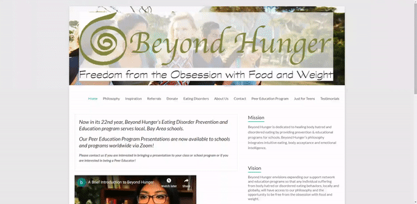
Original website:
Methodology for Guerrilla Testing
The plan developed for this usability test applies a guerrilla test during an online meeting with participants previously screened and were able to test the website as potential users.
Each group member was responsible for applying one usability test recorded and uploaded to our drive folder.
Objectives
Observe how the participant navigates the website and realizes the tasks the interviewer asks.
Target Users
Adults in the group aged 22 to 45 years old who potentially would use Beyond’s hunger website seeking help to prevent middle and high schoolers from eating disorders.
Task 1: Locate the information that answers the question: According to the website, what's the percentage of female adolescents suffering from anorexia nervosa?
Task 2: Locate the Psychologist (Barbara Murphy)'s personal website
Task 3: Find how to volunteer for Beyond Hunger, get the phone number
Analysis of Guerilla Tests

Key Takeaways from guerilla tests:
-
User had a hard time finding information for anorexia nervosa, browsed just for teens first before getting to the eating disorders page
-
User had trouble locating volunteer work section, tried “peer education program” first
-
User got confused with long texts on the page and found it difficult to find information
-
User found it difficult to find the search bar as it was on the footer instead of the top of the page
Competitive Analyses
We had a total of 5 competitors: 3 of them direct and 2 of them indirect. Some of the competitors had features which Beyond Hunger didn't have, due to the size and monetization of the companies. Their navigational pros included:
-
Providing outsource articles for more information
-
The search bar being at the top
-
Having a main menu and sub-menus as well
-
Messaging functions
Cons:
-
Sub-tabs are hidden until the user clicks something
-
Navigation tabs not being hierarchical
-
Links are inappropriately colored
-
Lack of testimonials
I made an "I like, I wish, what if" with the thinking that brainstorming things I like about the iterated website, what things (like a following donate button) would be helpful and don't have yet that could benefit other areas of the website; and features that we just don't have and/or are a stretch.
Examples from the results are as follows:
-
I like that I can find a lot of information of different eating disorders in the website.
-
I wish there was an easy way to find information about taxes.
-
What if Beyond Hunger's website had a chat help option where volunteers can manage live questions?
Card Sorting
To understand the hierarchy of the buttons in the navigation menu, utilities, and footer, I put them all together and sorted them so that they would make the most sense and take up less time for users to find what they're looking for.
The navigation menu has all user-related actions, such as when they're looking for more information on anorexia nervosa or Beyond Hunger's board members. The utilities have a search bar, contact us, donate, and a number to call BH. The footer would be where users go after they're satisfied with the main functions and resources of BH; like when they want to share BH's articles on their social media.
Information Architecture, Sketches and Prototyping
After card sorting the utilities, footer, and navigation bar headings in the website to match the information to headings in the most accessible way, we did a site map and user flow to visualize/get ready for the lo-fi desktop prototypes.
As a group, we split up the sketches where we found things we liked and wanted to keep, such as a following donate button, which I decided would be a little too assertive, so I suggested we used a heart icon next to the word. We all liked that idea.
I thought presenting the lo-fi and hi-fi desktop prototypes in a Z-shape layout would be easier on the user's eyes


Hi-fi Desktop prototype


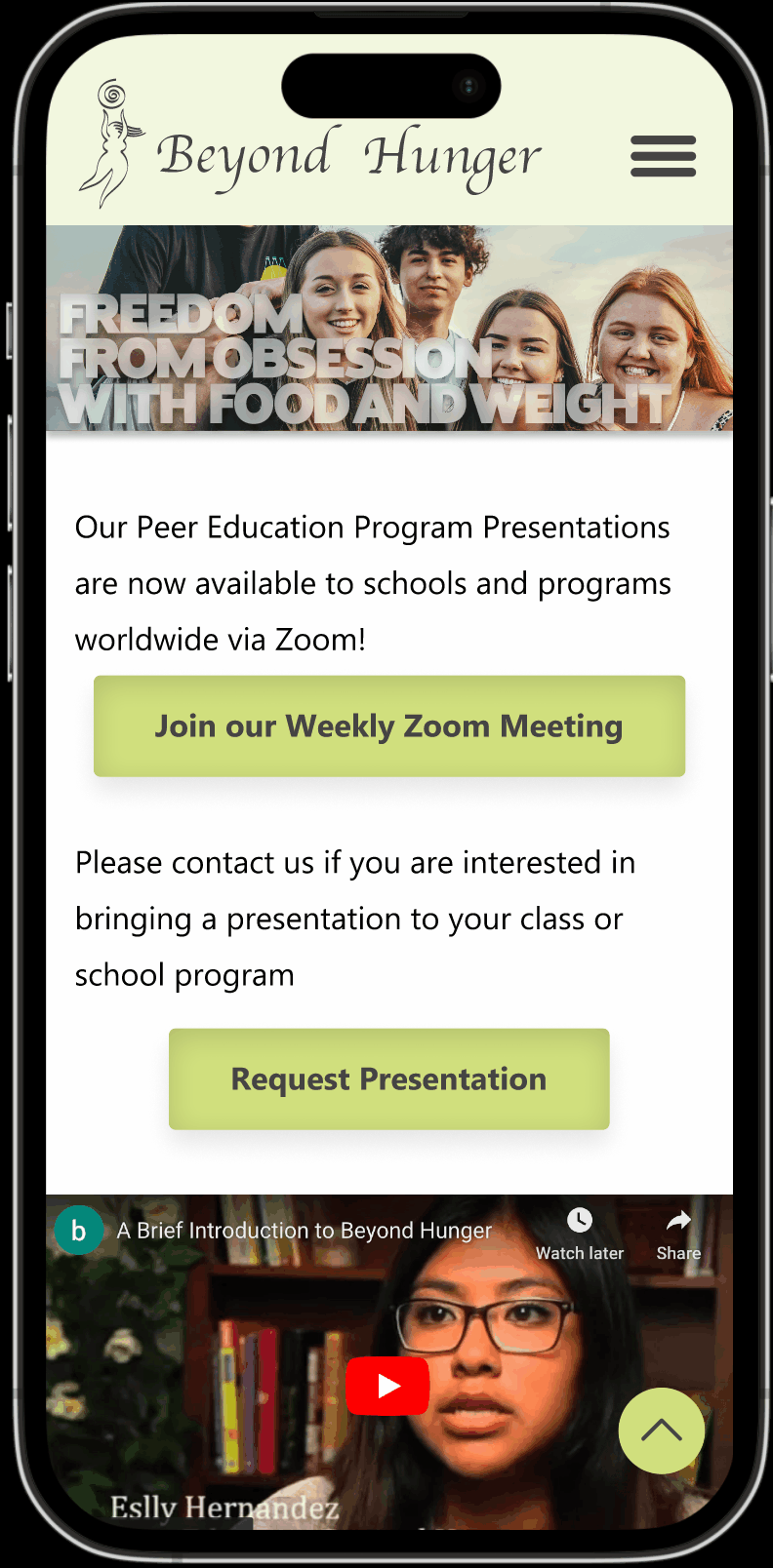
Final mobile prototype
In the end
-
Tax ID was made more accessible by placing it in multiple locations throughout the website
-
Added additional hyperlinks to various social media platforms to enhance its online presence, increase website visibility and promote user engagement
-
Added more navigable information architecture, improving labeling and categorization
-
Facilitated volunteerism and the opportunity to request a presentation by making forms more discoverable
Before I interviewed the Stakeholder...
The heuristics were based off Jakob Nielsen's Ten Usability Heuristics:
First impression/appearance of the site, content, navigation, and efficiency for the site to be readable and enjoyable without making errors (or if the users do make errors, to anticipate and help the users).
Based on the results from the heuristic evaluation, we conducted a SWOT analysis:
(right)

Stakeholder Interview
I set up an interview with Katy to determine the stakeholder's needs:
-
a simple website with no clutter
-
to promote body image acceptance
-
make donations and Tax ID info more visible
-
creation of presentation and volunteer forms
-
highlight the resources (podcasts, books, donor options, presentation requests, and mediation cards) they have for those interested
-
reach more people and train young high school students or early college age about the dangers of dieting and help build self-esteem
-
promote body image acceptance
Prioritization map from Stakeholder's interview:

User Persona- a fictitious person with real user goals
We needed a User Persona to target a specific user who would use Beyond Hunger's resources, used sliding scales in order not to stereotype, and put common audiences' minds together. I also think mental illnesses come from thoughts the media puts into people's heads, and it is such a taboo topic to talk about, despite how every student is on social media. Students may not realize it on their own, so it's up to instructors like Jessica to put it to light.
"The teenagers I work with are not comfortable opening up with our school administration team, so we need extra help to prevent future mental illnesses." (Jessica Miller).

Now, we need a UX Scenario to put into perspective what the user's needs , motivations, bio, and pain points do, to work along with the non-profit in order to achieve their goal. This UX Scenario is also coming from a part of myself, in which school counselors really do want the best for students and their way to do that is to take matters into their own hands. In that some students might not take into heart Jessica's (school counselor) words as she is an adult and not one of their peers, she believes a school presentation from professionals would stick in their minds.

Storyboard
This storyboard I drew shows Jessica having a problem and how interacting with BH works for her in a storytelling way that helps us UX designers determine what's most important in a scenario (as well as bringing to light how the features in BH, such as a presentation request, books, information about troubled eating/body image, and peer education programs, help people).
