Gov. web/mob Redesign: Department of Energy
Understanding
Department of Energy
Original website:

DOE's Mission
"To ensure America's security and prosperity by addressing its energy, environmental, and nuclear challenges through transformative science and technology solutions."
This is an existing government website redesign project created by UX/UI Designers
My Role
I guided my team through:
-
Designing the proto-persona and user path.
-
Conducting heuristic evaluation analysis and creating mood boards.
-
Formulating user testing plans and analyzing the prioritization matrix.
-
Ensuring color accessibility and performing card sorting.
-
Developing site maps for the project.
-
Annotating the original website's functions.
-
Analyzing the Department of Energy user interface navigation.
-
Final analysis on further quality assurance and organization.
Discovering Problems
Goals in organizing Government Agency Navigation:
-
Analyze the Department of Energy user interface
-
Understand the usability of the government website
-
Make recommended redesign changes to improve the user experience
After User Testing and doing a Heuristic Evaluation analysis on the original website, the insights/problems I uncovered were:
-
Many of our users used the search function (which could mean the CTAs and navigation are hard to understand)
-
A lot of the information (in navigation bar, body, and hyperlinks) look very similar to each other; thus it’s not clear what to click on when you have a goal in mind
-
The hyperlinks should be organized in a section rather than scattered throughout a page with text heavy articles and information
-
Breadcrumbs should match the headings, word for word
-
The “energy saver” logo/icon doesn’t do much in terms of helping the user find information, and takes up space
I used the Heuristic Evaluation to categorize all the problems I sifted out from the website into user pain points, usability, and accessibility.
UX Designers:
Joyce Chen
Sreelu Reddy
Nadiyah Salahuddin
Alena Koval
Timeline:
Two weeks
Proto-persona

Prioritization Matrix of User Testing notes: key findings
-
Wants the tax calculator to be more discoverable
-
Hover navigation menu is extremely functional
-
Text was blurry, the search bar had poor color contrast and was hard to read
-
When trying to find how to save money and energy, user goes to energy and economy (which is wrong) instead of save energy, save money. (which is right). Thus, words need to be more clear
-
Categories from the hover menu under “Save Energy, Save Money” DO NOT match the categories inside said menu-link
-
Search bar is a great way to get to the goal fastest
Moodboard

-
We looked at other websites for UI Pattern inspiration and guidance
-
Creating a moodboard helped us to understand areas of opportunity for website usability and UI improvements
User Test Tasks
-
Find the pages to contact DOE about their homeowner inquiries
-
Find information about solar panels for home use
-
Find info about job opportunities for recent grads
User Testing Results:
-
Content links need better labelling and placement
-
Search bar should be more prominent on the site. Users relied heavily on this feature.
-
Information is hidden to many users due to primary and secondary header labeling. A Tertiary navigation bar is recommended.
-
Topics are organized by ‘expert fields’ or ‘specialization’ and not by topic
-
Utility bar and footer were used often, especially on mobile devices.
Card Sorting (part 1 and 2)
For part one, we grouped the primary and secondary header links into categories based on where they would fit best. We highlighted the navigation headers that needed further examination in pink.
We decided to redesign the navigation on the primary and secondary page to include:
-
Renaming for better findability
-
Reorganization for more intuitive grouping
-
Tertiary navigation for information accuracy and to accommodate the volume of information
I made a new Site Map based on these results.
New Site Map
Navigation
-
Move the "Leadership" link menu and make it a secondary navigation option under a newly created primary “About us” navigation link. We did not think that a leadership link needed a prominent place on the global navigation menu
-
Add “Publications” menu and retain social media icons throughout all the pages. “Publications” would serve primarily as source for scientific papers and articles
Main Navigation
-
Primary and secondary navigation bars should have the same header names for consistency, ease of use, and findability
-
“Save Energy, Save Money” menu category is renamed to “Consumer Energy Resources” to clarify the target user group; menu categories within it are relabel to better represent featured content
-
“Energy Sources” is added as a new menu category
-
Add an “About us” in the main primary navigation bar with secondary navigation for “mission, leadership, contact information, etc.”
Save Energy, Save Money Navigation Header and Page
-
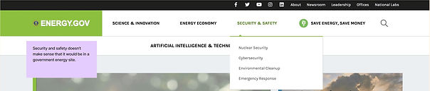
Make the “Save Energy, Save Money” drop down hover menu options on the energy.gov website match the primary navigation headers on the “Save Energy, Save Money” page. The largest problem with the energy.gov site is that the hover menu options on the MAIN PAGE and the primary navigation menu on the SECONDARY PAGE are completely different when they should be 1:1 and exactly the same
Footer
-
Completely new site maps and e-office portals were added to the footer
-
All headers in the footers of primary and secondary pages should stay the same no matter what page the user is on
-
“History”, “DOE STEM”, and “Careers” were moved out of the footer and into “About Us” page in the navigation bar
Final Analysis
Quality
-
A quality check review of the site would resolve errors such as empty links, error codes, information architecture order, mismatched visuals, and incorrect bread crumb displays
-
Nomenclature and consistency of nomenclature needs improvement
-
Naming convention needs work
-
It was hard to distinguish the difference between “About” and “About us”
-
“Save Energy, Save Money” and “Home Comfort” menu links needed better definition and clarification
Organization
-
Create better primary and secondary navigation headers.
-
Create cards for hyperlinks organized by topic.
-
Improve information findability for information that is embedded and lost in text heavy articles
Annotations of DOE
Annotations of Utility Navigation bar

Search bar

Tertiary Navigation bar (Science & Innovation)

Tertiary Navigation bar (Energy Economy)

Tertiary Navigation bar (Security & Safety)
Energy Saver Blog & Water Heating

Main Navigation bar

Tertiary Navigation bar (Save Energy, Save Money)

Footer
